Addressing Nextdoor's UX and engagement problems

Addressing nextdoor's chalge to with better engagement and enhanced UX on desktop compared to mobile users

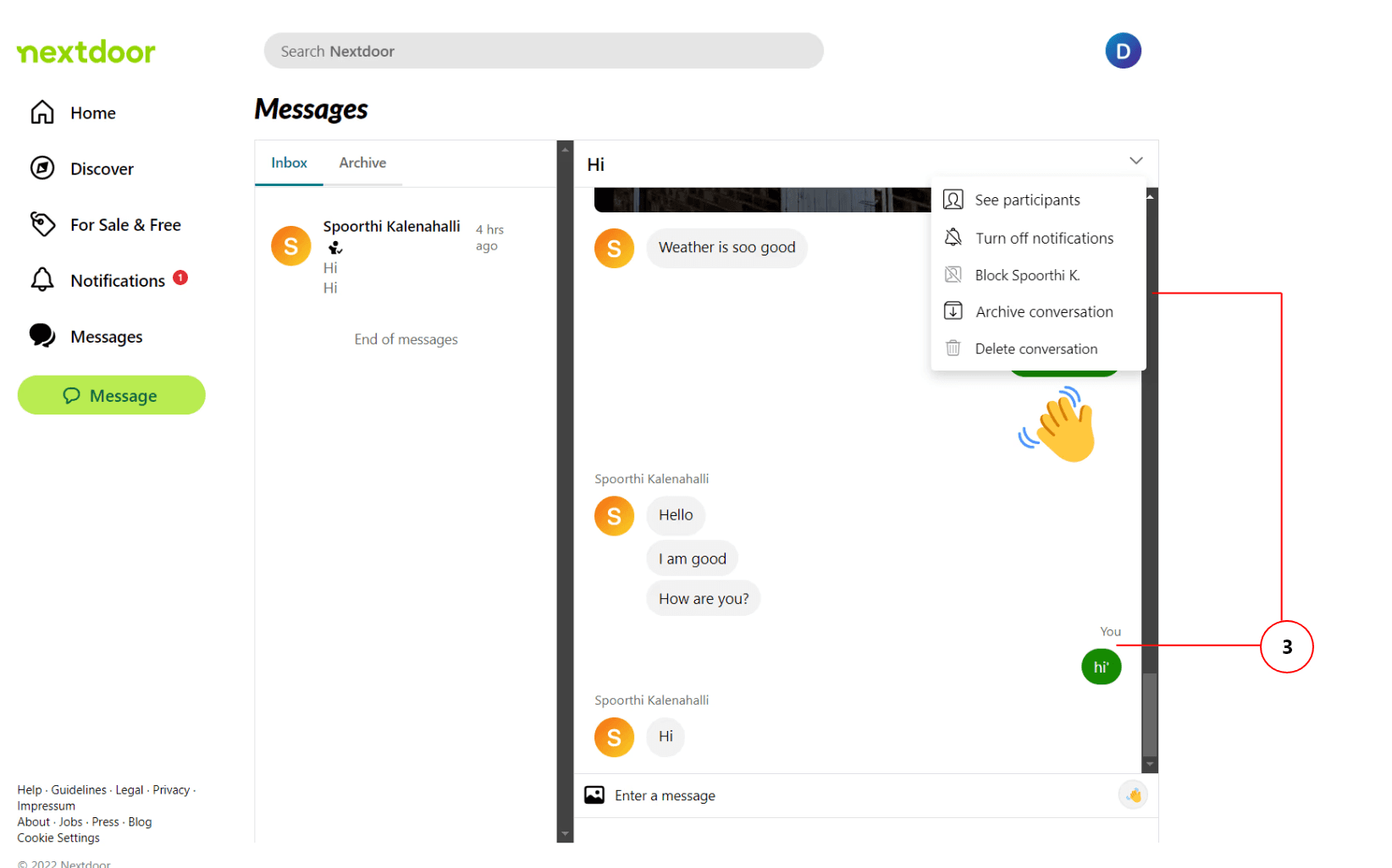
The goal of this project was to enhance Nextdoor's UX, making it more intuitive, efficient, and enjoyable for users. This involved evaluating the platform's current usability, identifying pain points, and designing solutions to address those issues. I led a comprehensive redesign of Nextdoor's website, resulting in a 35% increase in task completion rates and a 20% reduction in user errors, by revamping the IA and adding new features.

Disclaimer: The success metrics is based on the usability testing on the final prototype* vs the live Nextdoor website side by side during the time of redesign.

Role

UX Designer, Usability testing

Tools

Figma, WAVE, Optimal Workshop, Google forms

Duration

4 months

Nextdoor home page
Nextdoor home page
Nextdoor home page

Challenge

Nextdoor's feed felt so cluttered, making it hard for users to find relevant and recent posts. There’s no clear way to filter out outdated content, and the navigation isn’t always intuitive. Users struggled with readability, accessibility, unclear navigation that hindered their overall experience on the platform.

Solution

Based on the findings, I proposed & redesigned the following solutions:

Discover Section: The enhanced Discover section resulted in a 40% increase in user satisfaction and a 25% increase in discoverability for events.

Information Architecture: The redesigned information architecture led to a 35% increase in task completion rates and a 20% reduction in user errors.

Group Features: Introducing group features increased user engagement by 30% and led to a 20% increase in time spent on the platform.

Messaging Functionality: expanded messaging features improved user satisfaction by 25% and reduced frustration levels.

15% increase in user satisfaction

23% increase in task completion

7% reduction in error rates

15% increase in user satisfaction

23% increase in task completion

7% reduction in error rates

15% increase in user satisfaction

23% increase in task completion

7% reduction in error rates

Nextdoor UI
Nextdoor UI
Nextdoor UI
Proposed Solution
Proposed Solution
Proposed Solution

Research

Initially, I did some desk research to identify the areas of improvement and conducted usability testing with the participants. Based on the information gathered, the pain points of the users were identified. The participants were selected based on their age, internet usage, and device familiarity.

UX Process

Conducted in-depth interviews and usability tests with 5 participants to gather user feedback and identify pain points. The number of participants was chosen based on Nielsen's research on user testing and to maintain time effectively for the project.


Empathize: Developed a deep understanding of users' needs, goals, and frustrations through empathy mapping and journey mapping.

Define: Clearly articulated the problem statement and project objectives based on user research findings.

Ideate: Generated a range of potential solutions and design concepts using brainstorming and design thinking techniques.

Prototype: Created low-fidelity and high-fidelity prototypes to visualize the proposed designs.

Test: Conducted additional usability testing with the prototypes on a new group of 5 participants to gather feedback and iterate on the designs.


By including individuals who have special needs, I gained valuable insights into inclusive design principles. This experience enhanced my skills in creating and testing products that are usable by everyone.


Personas

Personas were developed based on the interviewed participants and the insights gathered from them.


By including individuals who have special needs, I gained valuable insights into inclusive design principles. This experience enhanced my skills in creating and testing products that are usable by everyone.

70-20-10 Rule

No project ever goes exactly as planned, but here’s how I navigated the challenges and adapted my approach using the 70-20-10 model:

70-20-10 Rule

No project ever goes exactly as planned, but here’s how I navigated the challenges and adapted my approach using the 70-20-10 model:

Information Architecture (70%) – Laying the Foundation Right

I aimed to enhance the information architecture to improve navigation and reduce cognitive load.

🚀 I adjusted my approach based on user feedback, and the redesigned IA ultimately led to a 35% increase in task completion rates and a 20% reduction in user errors.

Interaction & Engagement (20%) – Boosting User Involvement

I planned to refine the Discover section to make events more accessible and relevant, as well as introduce group features to foster better engagement. As priorities shifted, I iterated on these features through usability testing, leading to a 40% increase in user satisfaction and a 25% boost in event discoverability.

🚀 Group features, in turn, drove a 30% rise in engagement and increased time spent on the platform by 20%.

Emotional & Psychological UX (10%) – Fine-Tuning the Experience

Expanding messaging functionality was meant to reduce friction and enhance communication.

🚀 While these tweaks seemed minor, they resulted in a 25% increase in user satisfaction and a noticeable drop in frustration levels.

Results

What changed for the users?

Results

What changed for the users?

📈 Task Completion: +35% (Users found what they needed much faster!)
📉 User Errors: -20% (Fewer mistakes, less frustration.)
😊 User Satisfaction: +40% (People actually enjoyed using the site!)
💬 Engagement in Groups: +30% (More conversations, stronger communities.)

📈 Task Completion: +35% (Users found what they needed much faster!)
📉 User Errors: -20% (Fewer mistakes, less frustration.)
😊 User Satisfaction: +40% (People actually enjoyed using the site!)
💬 Engagement in Groups: +30% (More conversations, stronger communities.)

redesign 1
redesign 1
redesign 1
redesign 2
redesign 2
redesign 2
redesign 3
redesign 3
redesign 3

What I learnt and why it matters

What I learnt and why it matters

Great UX isn’t just about looks—it’s about making things work.

Users don’t care how beautiful a site is if they can’t navigate it.

User feedback is everything.

Talking to real users early on helped me pinpoint the biggest frustrations.

Good Information Architecture can transform an experience.

Cleaning up navigation dramatically improved usability.

Small changes can have a massive impact.

Just tweaking filters and messaging features made a huge difference in user satisfaction.

Other projects