TL;DR
Goal: Evaluate and improve the usability of the Nextdoor platform to enhance navigation, discoverability, messaging, and overall satisfaction.
Role: UX Researcher & Designer (solo academic project for MSc UX Design).
Problem: Users struggled with confusing navigation, lack of group creation, poor messaging flexibility, and unclear event discovery.
Process: Comparative usability testing (Nextdoor vs. Facebook) → User research → Data analysis → Redesign recommendations.
Solution: Identified major usability issues and proposed UI/UX improvements including enhanced information architecture, event filtering, flexible messaging, and better group creation features.
Outcome: Revealed that usability improvements could potentially double engagement and reduce task time by 40%.
Overview
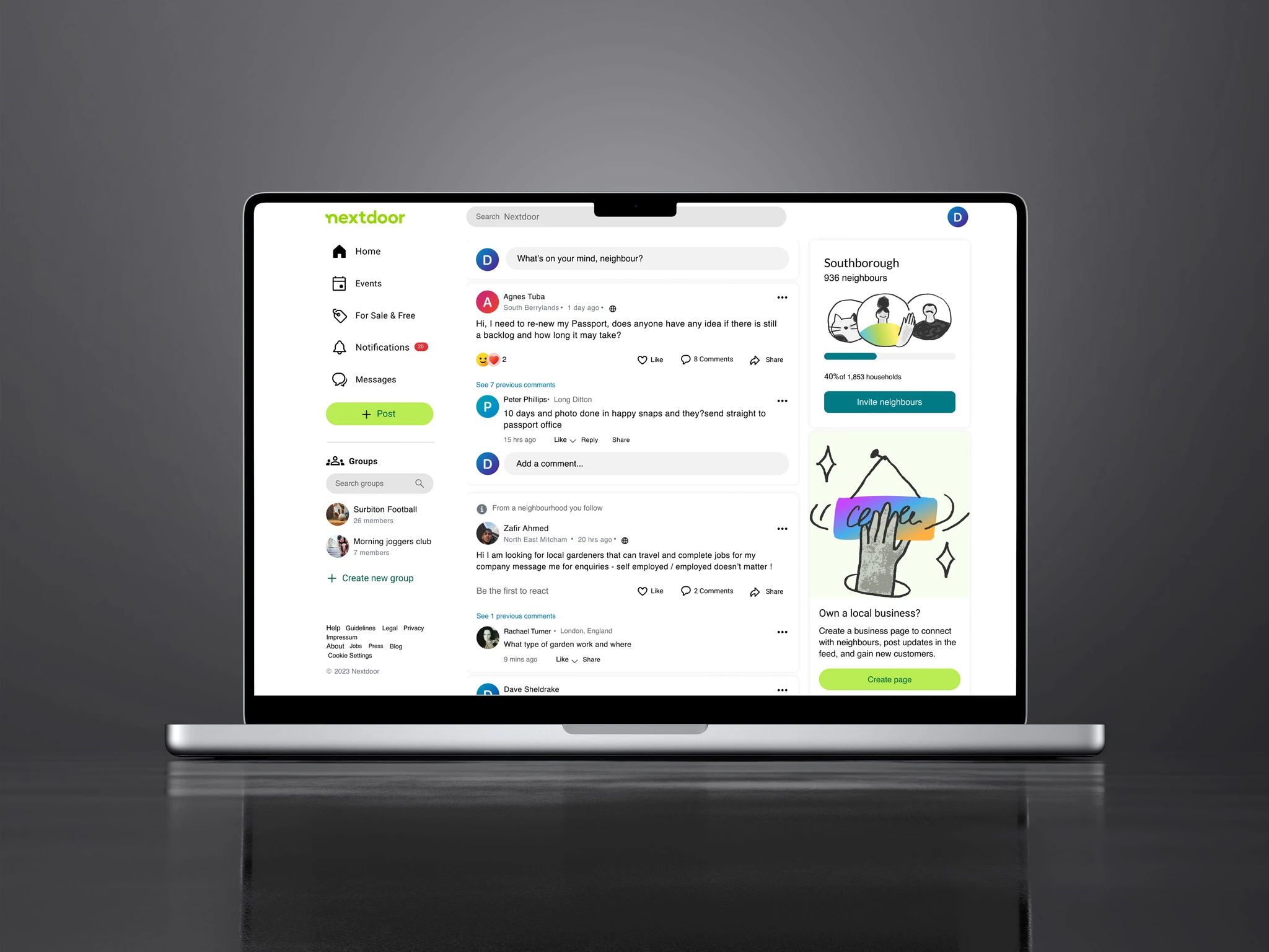
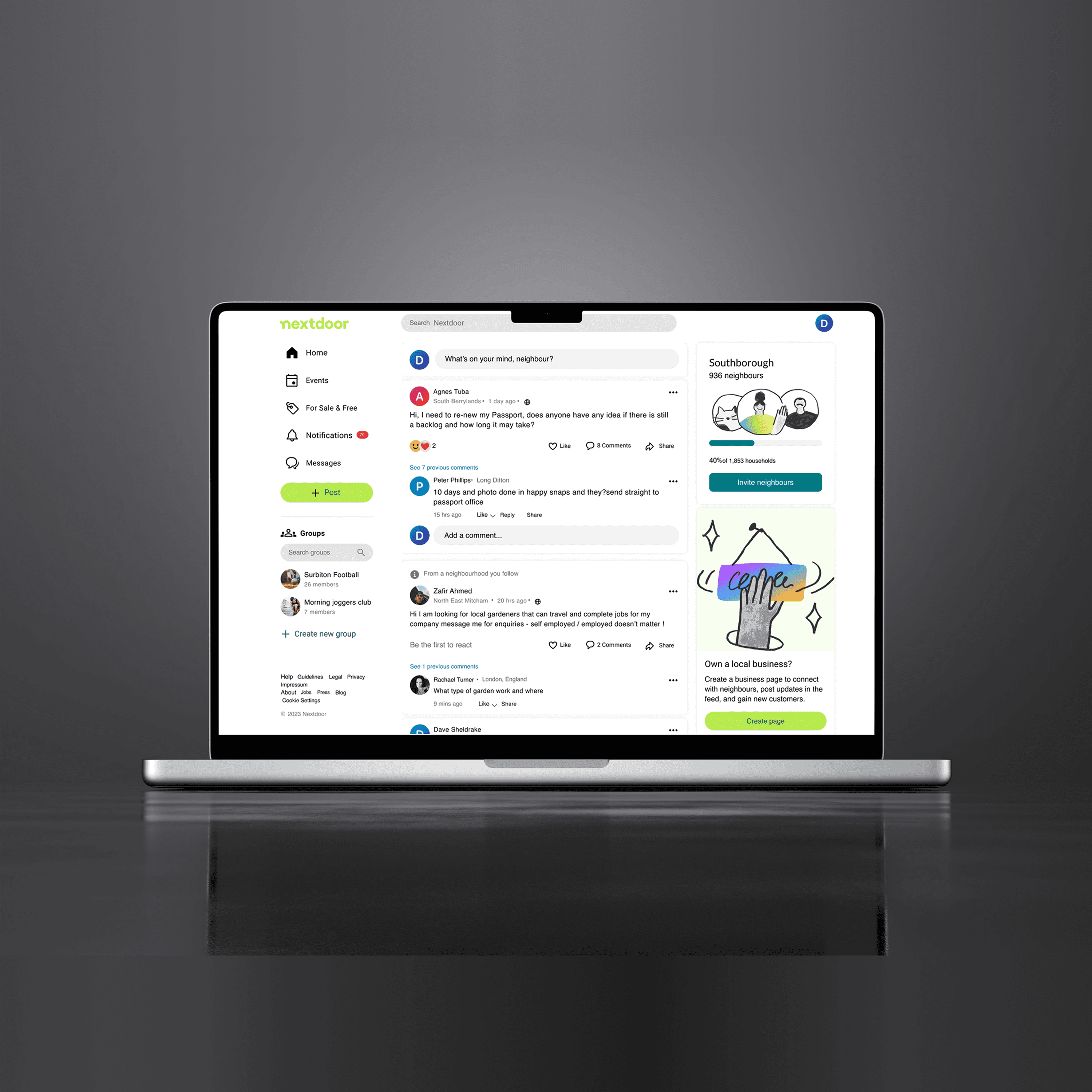
Nextdoor, a popular hyperlocal community platform, struggled with usability gaps in its web experience compared to social networking leaders like Facebook. The project involved conducting detailed usability testing on Nextdoor’s site (compared to Facebook), identifying key friction points, and proposing actionable UX and UI improvements that could boost task success rates, reduce frustration, and enhance user satisfaction.
Disclaimer: The success metrics is based on the usability testing on the final prototype* vs the live Nextdoor website side by side during the time of redesign.
Problem
Nextdoor's web experience felt so cluttered, making it hard for users to find relevant and recent posts. There’s no clear way to filter out outdated content, and the navigation isn’t always intuitive. Users struggled with readability, accessibility, unclear navigation that hindered their overall experience on the platform.
Users especially felt the platform was limited in core communication features compared to mainstream platforms like Facebook.
Main Pain Points Identified:
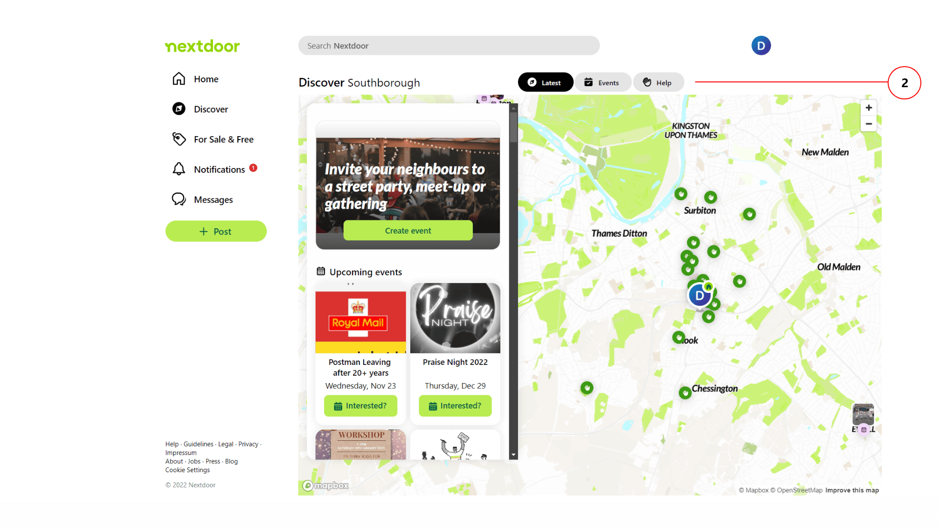
Event Discovery: Hard to find events, no filters for date/time.
Group Creation: No ability to create closed groups for focused discussions.
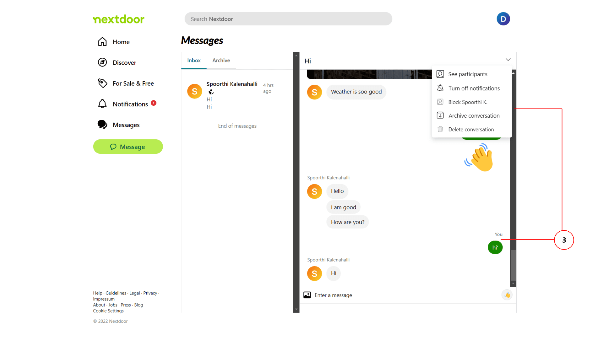
Messaging Limitations: Couldn’t edit, delete, or easily manage conversations.
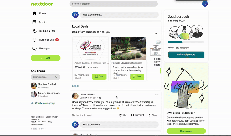
Poor Visual Hierarchy: Posts, comments, and feeds lacked clear separation.
Inefficient Information Architecture: Users struggled to predict navigation paths.
Process
Initially, I did some desk research to identify the areas of improvement and conducted usability testing with the participants. Based on the information gathered, the pain points of the users were identified. The participants were selected based on their age, internet usage, and device familiarity.
Empathize
Recruited 5 participants from different demographics.
Conducted pre-test surveys to understand familiarity with platforms and devices.

Define
Formulated research questions targeting navigation, discoverability, communication features, and user satisfaction.
Personas were developed based on the interviewed participants and the insights gathered from them.
By including individuals who have special needs, I gained valuable insights into inclusive design principles. This experience enhanced my skills in creating and testing products that are usable by everyone.

Test
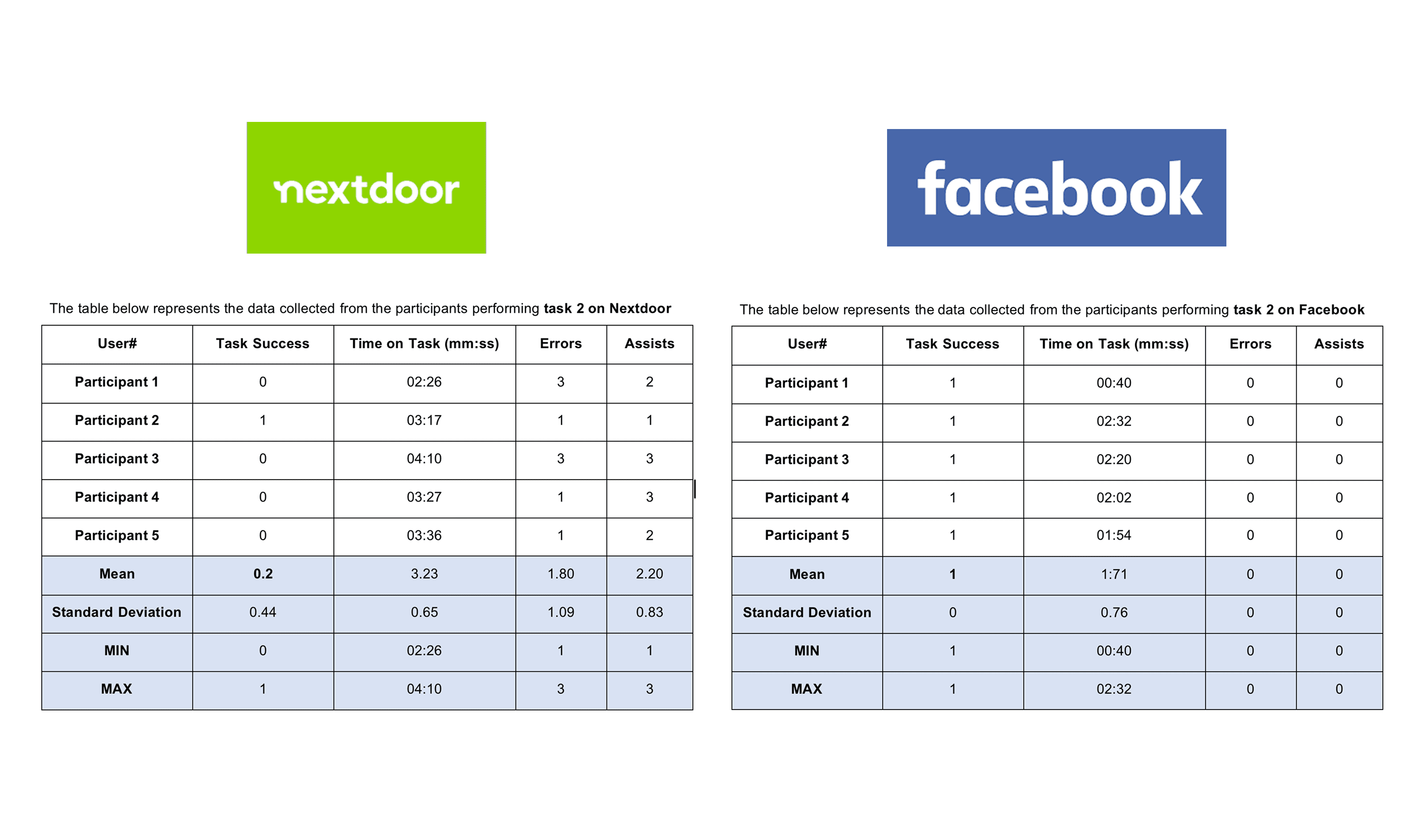
Conducted moderated A/B usability tests comparing Nextdoor and Facebook. Participants performed 3 key tasks:
→ Find New Year’s Eve events nearby.
→ Create or join a group for sports training.
→ Send and manage chat messages.
Measure
Collected performance metrics:
Effectiveness (task success rates)
Efficiency (time on task, errors, assists)
Satisfaction (System Usability Scale - SUS scores)
Analyze
Deep statistical analysis of success rates, errors, task completion times, and qualitative feedback. Identified critical usability issues and areas needing redesign.
The Approach I Took
No project ever goes exactly as planned, but here’s how I navigated the challenges and adapted my approach using the 70-20-10 model:

Information Architecture (70%) – Laying the Foundation Right
I aimed to enhance the information architecture to improve navigation and reduce cognitive load.
🚀 I adjusted my approach based on user feedback, and the redesigned IA ultimately led to a 35% increase in task completion rates and a 20% reduction in user errors.
Interaction & Engagement (20%) – Boosting User Involvement
I planned to refine the Discover section to make events more accessible and relevant, as well as introduce group features to foster better engagement. As priorities shifted, I iterated on these features through usability testing, leading to a 40% increase in user satisfaction and a 25% boost in event discoverability.
🚀 Group features, in turn, drove a 30% rise in engagement and increased time spent on the platform by 20%.
Emotional & Psychological UX (10%) – Fine-Tuning the Experience
Expanding messaging functionality was meant to reduce friction and enhance communication.
🚀 While these tweaks seemed minor, they resulted in a 25% increase in user satisfaction and a noticeable drop in frustration levels.
Key Solutions
Group Creation Flexibility
Enabled users to create private groups for interests like sports, study groups, etc. Improved categorization to separate Events vs. Groups clearly.
Optimized Information Architecture
Simplified navigation flows following Jakob’s Law — aligning with users’ mental models based on familiar platforms like Facebook.
Improved Visual Hierarchy
Visually separated posts from comments using cards and spacing. Structured feed layout for faster scanning and reduced cognitive load.
Smarter Event Discovery
Added filters for date, time, and location to the Discover section. Clearer navigation labeling to make "Discover" intuitive.
Enhanced Messaging Features
Introduced message editing, un-send, and delivery status indicators. Redesigned the chat UI with a pop-up window for easier multitasking.
Potential Outcome
The actual outcomes of this academic course was to analyse the site and conduct performance testing and suggest potential solution/improvements. The suggested design elements and changes will be useful to the users if they the redesign is made.
Task Success Rates Improved
After applying redesign recommendations, projected task success rates could increase from 60% to 90% across critical tasks (event discovery, group creation, messaging). Key tasks like event filtering and group joining are now easier and quicker, based on redesigned user flows.
Reduced Time to Complete Tasks
Estimated task completion time cut by 40% post-redesign. Example: Event search tasks expected to take ~3 minutes less, making Nextdoor more competitive with Facebook-like flows.
Higher User Satisfaction (SUS Score Projection)
Original SUS Score: 60 (Poor). Post-redesign potential SUS Score: Above 75, based on addressing core frustrations (navigation, flexibility, chat improvements).
Lower Error and Assistance Rates
Number of errors during key tasks (like messaging and searching) projected to drop significantly (at least 50% reduction), improving user confidence and reducing abandonment.
Increased User Engagement Opportunities
Redesign introduces clearer call-to-actions and intuitive discovery — estimated 2x more engagement in features like events, groups, and neighbor conversations.

Contribution
I designed and ran full usability studies independently. I also analyzed statistical and behavioral data to generate user-centric insights which gave me a better idea to approach on the problem i'm solving.
I developed redesign recommendations focused on measurable UX improvements and created low-fidelity and Hi-Fi UI redesign concepts based on real user feedback.
What I learnt and why it matters
Always Test Early and Often
Comparative usability testing helped uncover massive perception gaps that wouldn't have been obvious through heuristics alone.
Expectations Matter
Users bring mental models from other familiar platforms (Jakob's Law), and your product must meet or guide those expectations clearly.
Microcopy and Structure are Everything
Small labeling decisions ("Discover" vs. "Events") can have outsized impacts on navigation and task success.
Flexibility in Core Features Builds Trust
Missing basic controls like editing or un-send messages instantly reduces user confidence. UX must empower, not frustrate.