TL;DR
Goal: Redesign Federal Bank’s flagship FedMobile app to unify platforms, modernize the experience, and increase engagement: especially for Tier 3 & 4 cities.
Role: UX/UI Designer (contributed to product strategy, IA, and interface design).
Problem: Three separate apps created user friction; legacy design wasn’t serving a growing digital audience.
Process: UX audit → user interviews → wireframes → design system → usability testing.
Solution: One cohesive app that merges core banking and merchant services, with simplified flows and inclusive design.
Impact: Improved feature discoverability, faster task completion, and stronger engagement across regions.
Overview
FedMobile is the digital banking platform of Federal Bank, one of India’s leading private banks with a strong presence in both metro and non-metro regions. With over 3 million active daily users and 100+ financial services, FedMobile helps users transfer funds, invest, pay bills, manage insurance, and more—completely from their mobile phones. Federal Bank wanted to revamp the FedMobile app to better compete with modern fintech players and meet the evolving needs of its growing customer base, particularly those in Tier 3 and Tier 4 cities.
I joined to work along the designer who were leading the project already. We worked together to make the UX as seamless as possible for millions of users across India.
The Problem
The original FedMobile experience was fragmented three separate mobile apps were used for core banking, merchant services, and payments. This led to:
Poor user retention due to confusing navigation
Friction in discovering new features or services
Inefficient user flows, especially for less tech-savvy users
Lost market share to third-party wallets and neobanks
For a bank that aspired to be in the Top 10 digital banks in India, the status quo was no longer viable.
My Role
I joined the project mid-way as a UX/UI Designer, contributing to the redesign by aligning with the existing information architecture and design system already in place.
Reporting to the lead designer, I collaborated with cross-functional teams to:
Design and prototype new modules that fit seamlessly into the established structure
Create high-fidelity mockups aligned with the visual language and UX patterns
Support usability testing efforts by refining design decisions based on real feedback
I worked closely with stakeholders, product managers, and developers to ensure that each design delivered on both business goals and user expectations, while maintaining consistency across the platform.
The Process
Research & Strategy
Field research, stakeholder interviews, and over 50+ user surveys across user types (operative, non-operative, and merchant users) were conducted.
This helped us identify:
Key friction points
Trust barriers
Expectations from different geographies
We used the Design Thinking methodology to structure the entire process.
Personas & Scope
Based on research, we built multiple personas—such as young UPI-savvy students, merchant account holders, and elderly savings account users.
We consolidated pain points and identified gaps in:
Information access
Guidance during tasks
Customization based on use frequency
Information Architecture & Wireframes
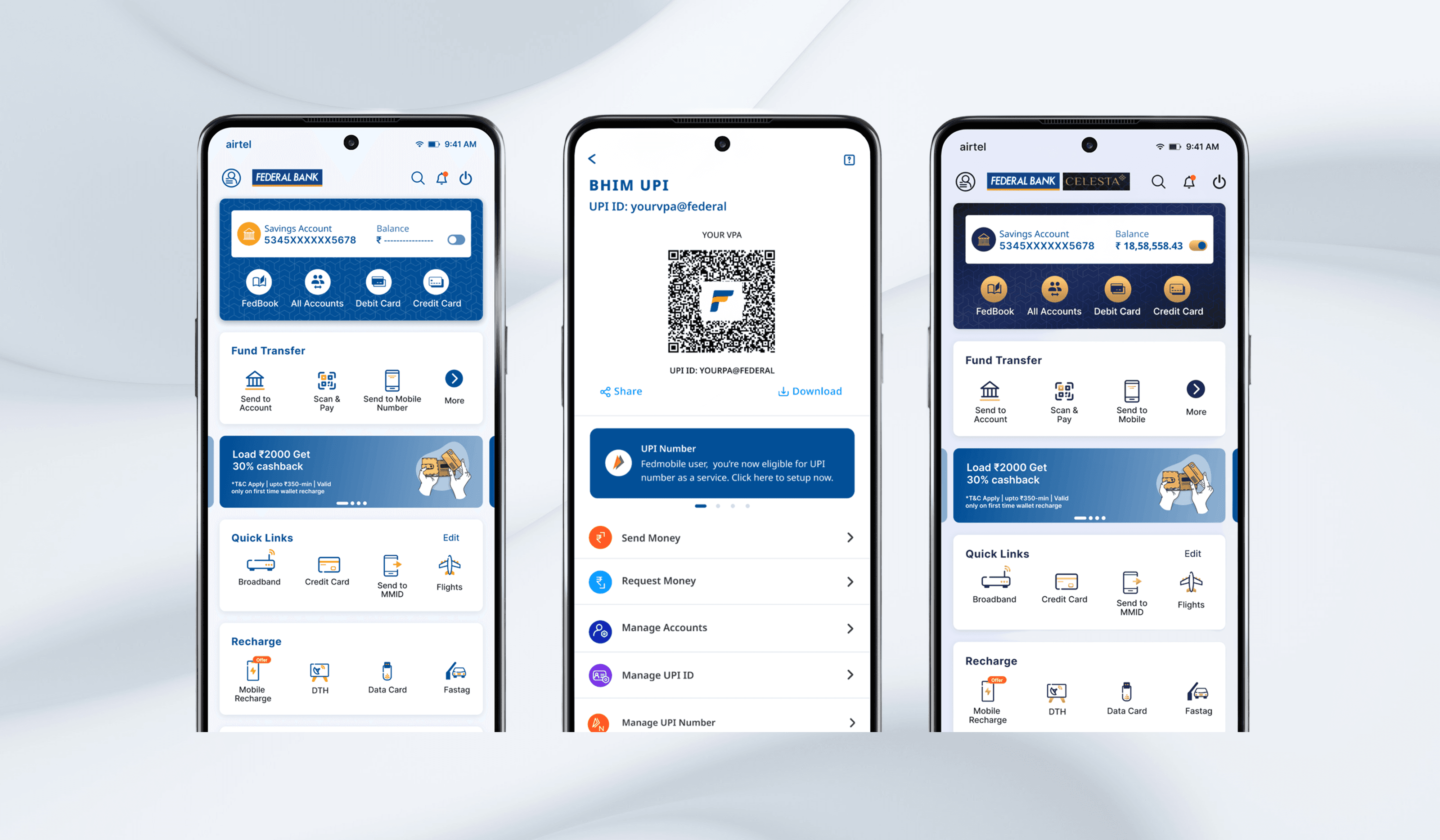
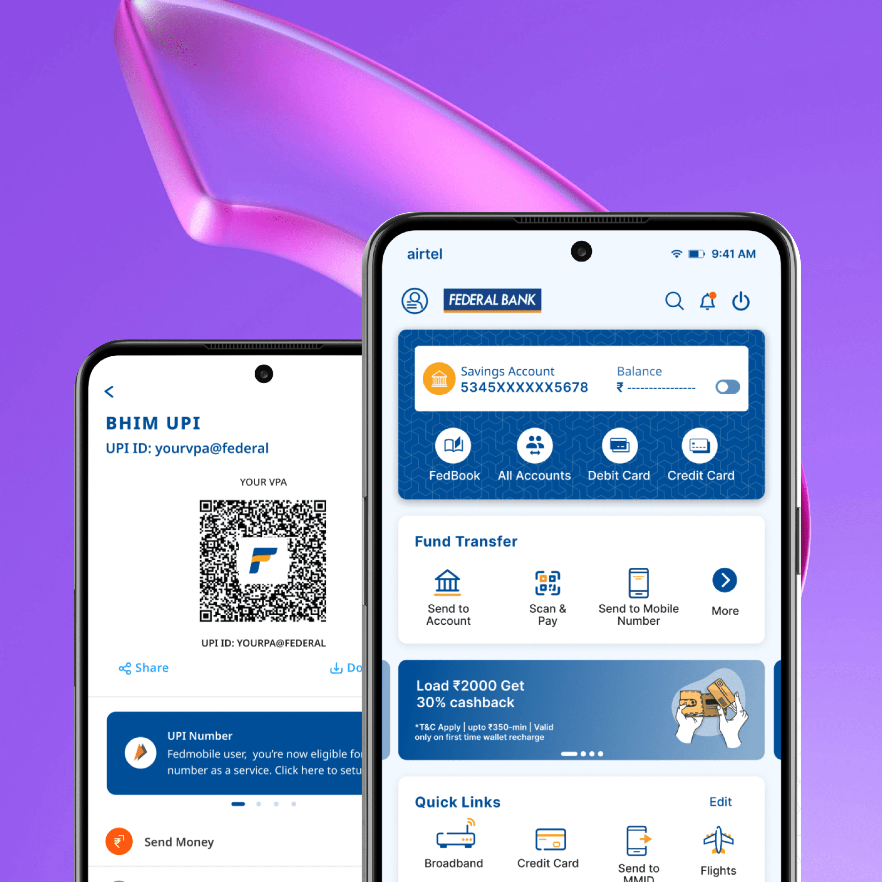
I created more than 100 wireframes, first in low fidelity (paper + digital) to rapidly test ideas, then mid and high-fidelity flows. We mapped and tested new navigation models and merged flows across banking and merchant services.
UI Design & Systems
We followed a modular design approach using atomic design principles to ensure scalability and consistency.
Created a flexible design system to support both standard users and premium customers.
Testing & Iteration
We ran CUG (Closed User Group) usability testing and did multiple rounds of feedback iteration.
The final design minimized cognitive load and improved discoverability.
Key Solutions
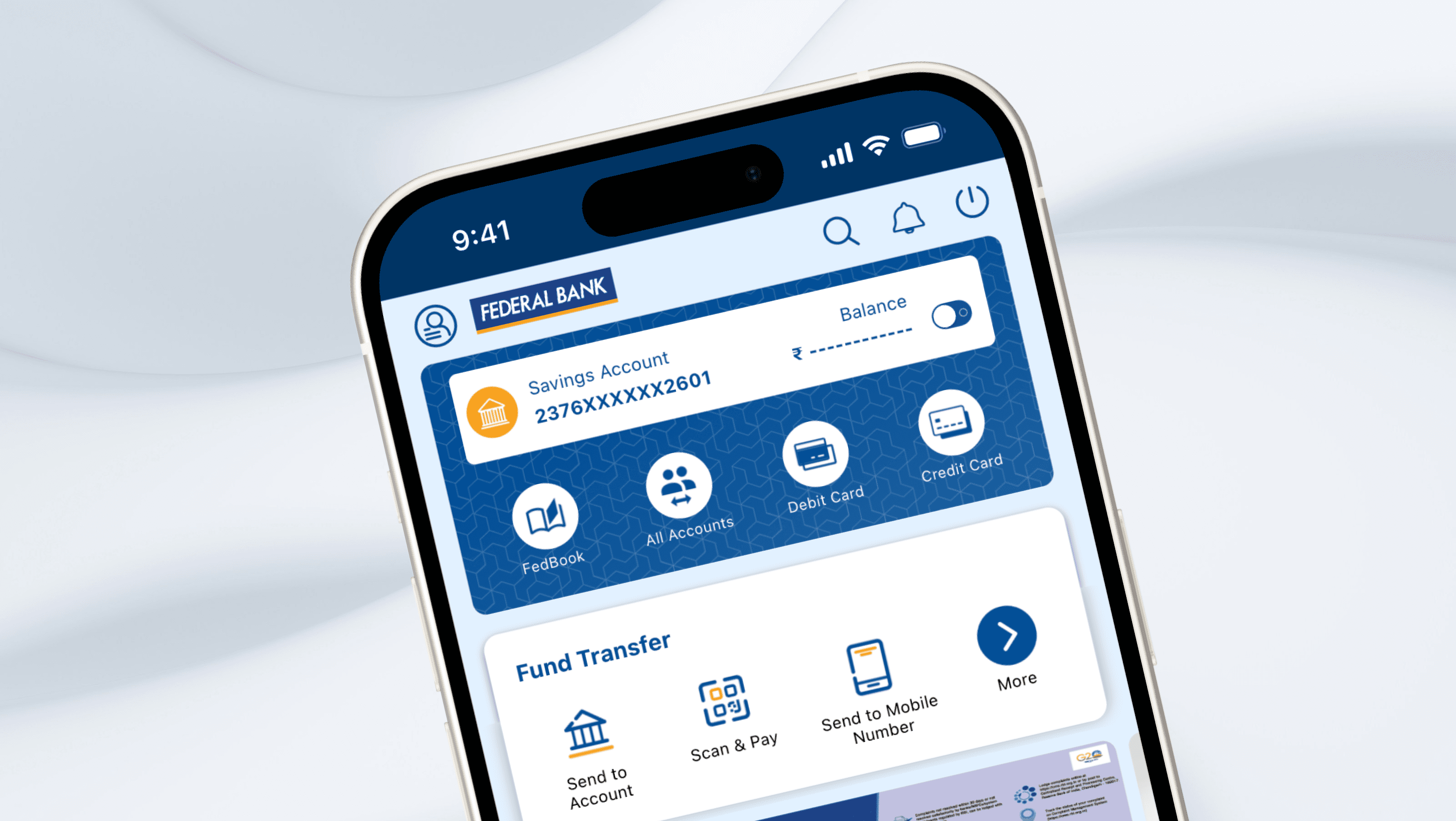
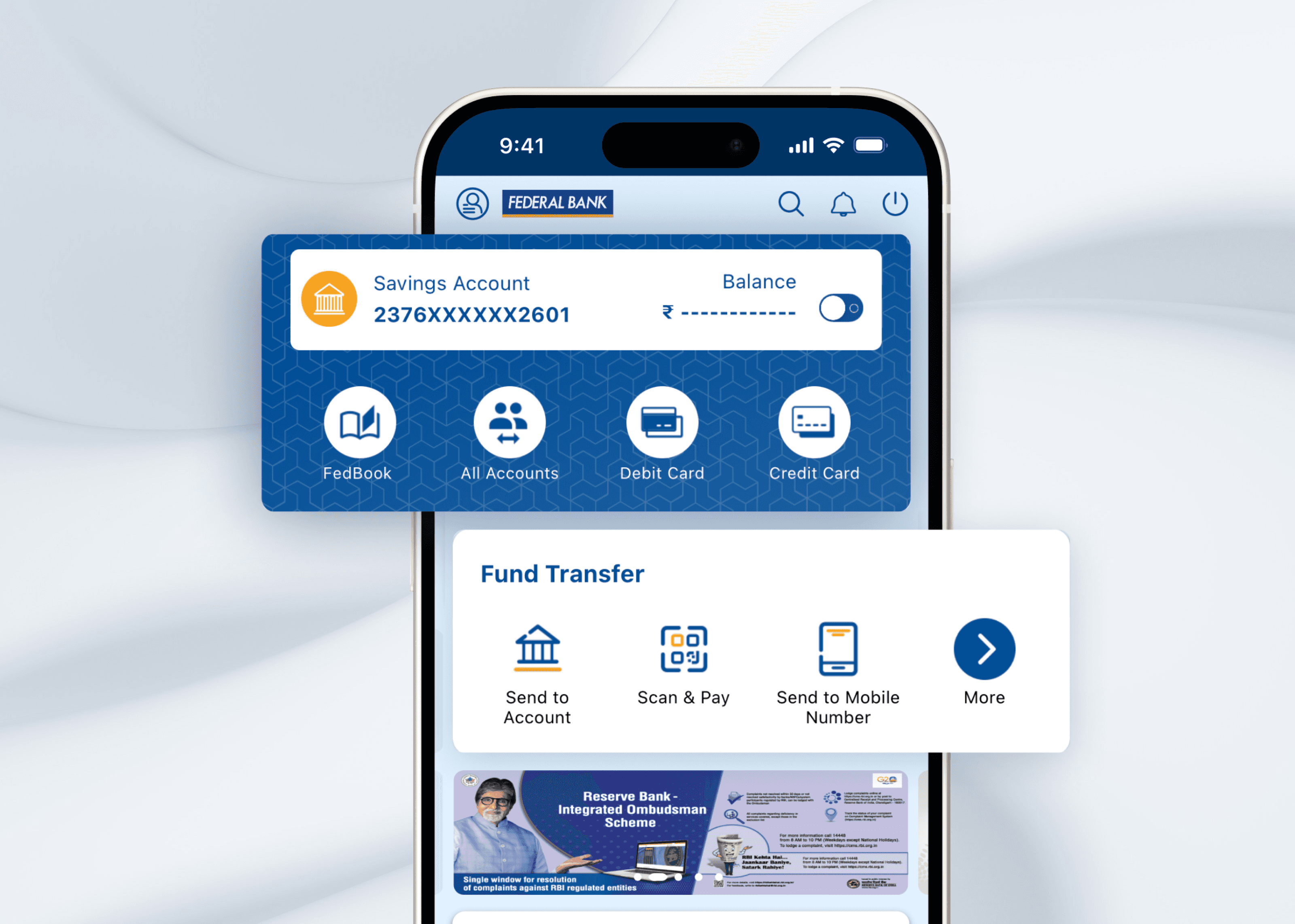
✅ Unified App Architecture — One single app replacing 3 fragmented tools.
✅ Inclusive Design — Designed for both tech-savvy urban users and digital-first rural customers.
✅ Guided Flows — Added contextual help and nudges to reduce task abandonment.
✅ Enhanced UI — Modern, accessible interface with consistent CTAs and visual clarity.
Impact & Metrics
3.7M+ active users per day
📈 Improved feature discoverability and user engagement in Tier 3/4 cities
🧭 Faster onboarding and simpler navigation led to higher NPS among non-urban users
🔁 Reduced churn from users switching to 3rd-party wallets or banking apps
Metrics such as System Usability Scale (SUS), Conversion Rate, and Net Promoter Score were tracked post-launch by the business team.
My Contribution
I played a central role in shaping the design direction from understanding the complex user base to delivering a unified design system and launching intuitive flows for everyday use cases.
This included:
Bridging tech and non-tech teams
Balancing stakeholder priorities
Designing at scale while staying user-centered
Designing consistency across multiple modules
Aligning with the lead designer when introducing new designs
Lessons Learned
This project reinforced the importance of co-designing with stakeholders early on. It also taught me that designing for financial inclusion in India requires empathy, education, and clarity especially for users not fluent in digital tools.
One of my key takeaways was how to balance complexity and simplicity by making powerful features easy to find, without overwhelming users.
Next Steps
Roll out more personalized content across use cases (e.g., investment suggestions)
Expand merchant marketplace flows
Introduce light/dark modes for accessibility
Continue iteration based on analytics and support feedback